Author
Published Date
May 26, 2026
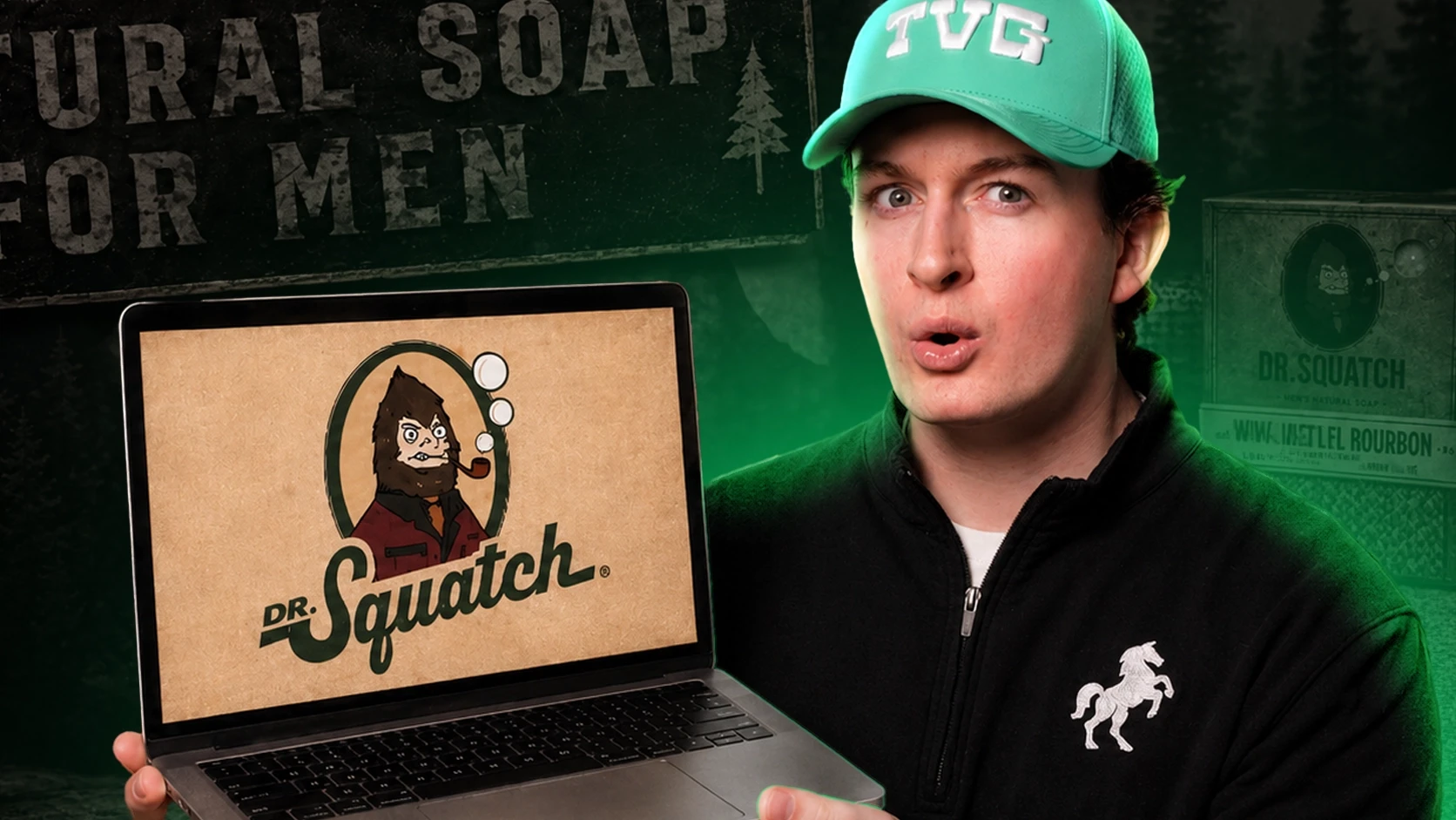
Unilever acquired Dr. Squatch for $1.4 billion. That number deserves more than a LinkedIn reaction -- it deserves a full breakdown of how they built a brand worth that much.
At TVG, we spend a significant portion of our time studying what the best brands in e-commerce are doing. Dr. Squatch is one of the clearest examples of a brand that constructed its entire growth engine around retention. Their paid acquisition is sharp, their creative library is deep, and their homepage is deliberately simple. The real architecture, though, is the system underneath: subscription, email, SMS, and loyalty working together to maximize the lifetime value of every customer they acquire.
This article walks through Dr. Squatch's complete funnel -- the homepage, cart upsells, abandoned cart email sequence, ad creative strategy, and cold traffic landing pages. Every tactic is documented with specific details so you can identify what applies to your brand and implement it.
Watch the Full Breakdown on YouTube
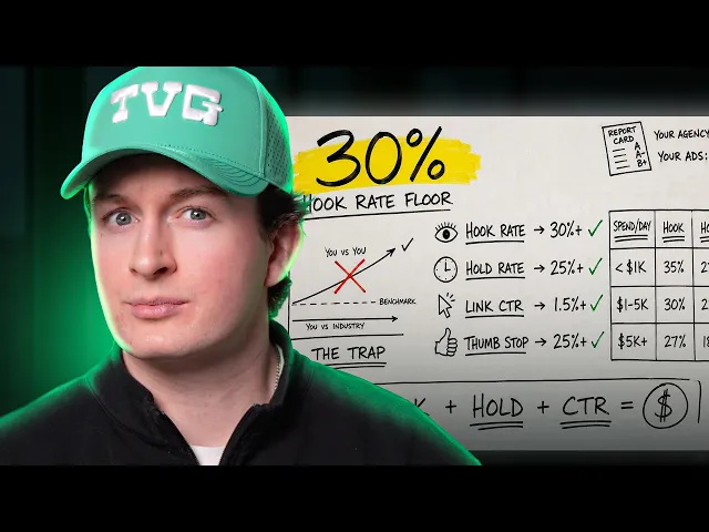
Patrick walks through all four creative metrics live, shows the exact brief template TVG uses, and shares how a supplement brand moved hook rate from 17% to 31% in 60 days.
The Homepage: Simple on Purpose
The first thing you notice about the Dr. Squatch homepage is what is not there. No rotating banners pushing five different offers. No mega-menu with a dozen sub-categories. The page is clean, fast, and built around a single path to purchase.
At the time of this breakdown, they were running a Mother's Day promotion. The offer -- spend $65 and receive a free Jukebox three-pack -- appeared in the announcement bar, the hero section, and again throughout the page. That consistency is intentional. Any sitewide sale should be treated this way: one clear offer, surfaced at every touchpoint from the header to the cart.
Perceived Value Rule Whenever you include a freebie or bundle item, state its retail value explicitly. Dr. Squatch communicates that the Jukebox three-pack carries a $21 value. That single line of copy makes the offer feel like a genuine deal. Skip that line and customers assign their own value to the gift -- and it is almost always lower than reality. |
Below the hero, the page follows a logical progression: starter bundles for new visitors, scent lineup with descriptive copy (critical for a product customers typically evaluate in-store by smell), a quiz-based lead capture tool, UGC and social proof, and subscribe-and-save options. Each element addresses a specific question a new customer would ask before buying.
The Over-Complex Homepage Problem Most e-commerce brands pack their homepage with every product category, brand story content, blog previews, and social feeds. The result is a page that converts poorly for everyone. Dr. Squatch's homepage has one objective: move the visitor toward a bundle purchase or into the subscription ecosystem. Every element earns its place by serving that objective. |
Homepage Structure That Works Above the fold: current offer or hero product. Below fold in order: best sellers or 'start here' bundles, product differentiation (scent, formula, USP), lead generation element (quiz or email capture), social proof (UGC, reviews, ratings), subscription or loyalty program. Keep navigation minimal. One clear primary CTA per section. |
The Subscription Engine: Building Recurring Revenue Like a Software Company
Dr. Squatch's entire growth model depends on a single behavioral shift: turning a one-time buyer into a subscriber. For a consumable brand -- soap, deodorant, grooming products -- subscription revenue is what makes the unit economics defensible. When customers subscribe, the brand builds predictable monthly revenue, reduces cost-per-order through fulfillment predictability, and creates a relationship that compounds over time.
The price incentive is the primary lever. On the cart page, the six-pack of bar soap lists at $42 full price. Selecting subscribe-and-save drops it to $31.68 automatically. No additional persuasion required -- the math does the work. A 25% discount for committing to recurring delivery is a straightforward value exchange, and most customers who see it take it.
RETENTION STACK | Subscribe and Save: Automatic 25% discount applied at cart when subscription is selected. Recurring delivery becomes the default, lowest-friction choice. SMS Capture at Checkout: Free product on next order in exchange for SMS opt-in. Converts a one-time transaction into an ongoing retention touchpoint. Loyalty Program: Points awarded on account creation, purchases, and referrals. Creates switching costs and a reason to return beyond the product itself. Email Flows: Abandoned cart, welcome, promotional, and new drop sequences that keep the brand present between purchase windows. |
|---|
Most brands implement one of these retention mechanisms. Dr. Squatch runs all four at once. A customer who goes through this funnel is subscribed, opted into SMS, enrolled in a loyalty program, and receiving regular email communication. That customer has a dramatically higher LTV than someone who made a one-time purchase and disappeared.
Subscription Revenue Math A customer who subscribes to a $31.68 six-pack every three months generates $126.72 in annual revenue with predictable fulfillment and no re-acquisition cost. A one-time buyer at $42 generates $42. The subscriber delivers roughly 3x the annual revenue at a fraction of the retention cost. This is the math that justifies aggressive customer acquisition spending. |
Cart and Checkout: Engineering the Average Order Value
Once a customer adds a product to cart, Dr. Squatch activates several AOV levers in sequence. Understanding the order of these levers -- and why they work together -- matters more than looking at any single one in isolation.
AOV Lever | Mechanism | Trigger Point |
|---|---|---|
One-Click Cart Upsells | Additional products offered in the cart drawer before checkout begins | After 'Add to Cart' action |
Free Shipping Threshold | Spend $19 more to unlock free shipping from current cart subtotal | Cart page, dynamically calculated |
Sitewide Offer Threshold | Spend $65 total to receive free Jukebox three-pack ($21 value) | Cart and checkout page reminder |
Subscription Default | 25% discount applied when 'Subscribe and Save' is selected in cart | Cart product option selector |
SMS Capture at Checkout | Free product on next order for opting into text marketing program | Checkout page, pre-payment |
The free shipping threshold is particularly strategic. With the six-pack at $31.68, a customer is $19 short of free shipping. That gap is calculated, not arbitrary. Close enough to feel achievable, large enough to require adding another product. The upsell carousel in the cart drawer exists precisely to capture that behavior. Brands that set their free shipping threshold too close to their average order value leave AOV on the table.
Risk Removal at the Cart Level Dr. Squatch's 30-day satisfaction guarantee appears on the cart page, on the landing page, and in the abandoned cart email sequence. For a product customers typically evaluate in-store by smell, the guarantee addresses the biggest purchase objection before it can form. If you sell something customers cannot experience before buying, a visible guarantee is not optional -- it is load-bearing. |
The Abandoned Cart Sequence: Six Emails Over a Few Days
When our team went through the Dr. Squatch funnel and abandoned a cart, six emails arrived over the following couple of days. The sequence runs on a discount escalation model: introduce a smaller discount early, deepen it over time, then create urgency before the window closes.
Subject Approach | Discount Offer | Key Element | |
|---|---|---|---|
Email 1 | Save your cart and save 10% | 10% off | Discount introduced immediately after abandonment |
Email 2 | Here's what you were squatching | 10% code included | Brand voice copy + product feed showing cart items |
Email 3 | Legendary lathers are just a quick click away | Satisfaction guarantee featured | Objection handling -- risk removal, no hard sell |
Email 4 | Deal sweetener -- now get 15% off | 15% off + 24-hour window | Discount escalation with urgency trigger |
Email 5 | Finish what you started -- 10% off | 10% off reminder | Re-engagement for earlier segment in sequence |
Email 6 | Last chance -- 15% off | 15% off final close | Hard urgency before discount expires |
The copy across these emails is consistently on-brand. Phrases like 'legendary lathers are just a quick click away' and 'here's what you were squatching' reflect a distinct voice that makes the sequence feel like communication from the brand rather than automated cart recovery. That consistency matters at scale because it builds familiarity across every touchpoint.
The Discount Escalation Risk Escalating from 10% to 15% across an abandoned cart sequence works -- but monitor carefully what it trains your customers to do. If buyers learn that waiting through the sequence reliably yields a larger discount, some will start abandoning intentionally. Watch for declining first-email conversion rates as a share of total sequence conversions. That trend is the signal. |
Promotional emails outside the cart sequence are notably minimal in design. New product drop emails feature one strong headline, a clean product image, and a single call to action. Promotional reminder emails restate the current offer without additional copy. The design does not compete with the message -- each email has one job, and the layout exists to serve it.
Ad Creative: 270+ Ads Running Simultaneously
Dr. Squatch was running over 270 active ads at the time of this breakdown. Most e-commerce brands run between 5 and 20. The gap in creative volume is not a budget issue -- it is a strategic decision aligned with how Meta's algorithm now evaluates and distributes creative.
Meta's Andromeda update shifted the platform toward broader distribution of creative across audiences, rewarding accounts that give the algorithm more options to work with. A larger creative library means more data points, faster learning cycles, and better matching between creative format and audience segment. Brands with narrow creative libraries are forcing the algorithm to make decisions with limited information.
Creative Type | Dr. Squatch Example | Primary Function |
|---|---|---|
Static Product Ads | Products on a clean tabletop, minimal text, yellow benefit callouts | Broad awareness, high frequency, low CPM efficiency |
UGC Videos | Organic-feeling testimonials, whispering hooks, unboxing formats | Cold traffic conversion, social proof delivery |
Founder Story | Jack (founder) telling the brand origin story direct to camera | Trust building, brand differentiation at scale |
Celebrity Collaborations | Megan Fox as 'Professor Fox,' WWE fighter-branded scents | Top-of-funnel awareness, demographic identity targeting |
Compilation / Animated | Animated offer reveal followed by B-roll product unboxing montage | Offer-driven acquisition, mid-funnel re-engagement |
Retail Channel Ads | Driving traffic to Amazon, Walmart, and Target listings | Sales channel diversification for brands at scale |
The celebrity collaboration strategy reflects a specific audience insight. Dr. Squatch's core demographic is young men, and their celebrity choices address a known motivator: men buy grooming products when those products are associated with being attractive to women. Megan Fox and Sydney Sweeney appear in ads that frame Dr. Squatch as the mechanism behind that appeal. The WWE partnerships attach brand identity to physical performance and masculinity. Each collaboration is a psychographic play, not just a reach strategy.
Creative Diversity as Algorithm Strategy Under Meta's current algorithm, creative diversity directly affects distribution efficiency. A single high-performing creative will plateau. A library of 20 to 30 active creatives across UGC, statics, founder story, and testimonials gives the algorithm room to find the right match for each audience and placement combination. The goal is sustained performance at scale, not just a strong launch week. |
The Cold Traffic Landing Page: Anatomy of a High-Converting Acquisition Funnel
Dr. Squatch does not send cold ad traffic to their homepage. They send it to dedicated landing pages built around a single acquisition offer. This distinction is fundamental -- and most brands get it wrong by pointing all paid traffic at their main store.
The landing page Patrick reviewed was built around a Squatch Stack offer: three free gifts, 59% off, with total value clearly displayed ($140 crossed out, $58 purchase price). Every element on the page exists to move a cold visitor from skepticism to purchase in a single session.
1 -- Lead With the Full Offer Stack |
The hero section states the complete offer: what you get, how many free gifts are included, the percentage off, and the individual items. Cold traffic does not know the brand -- they need the value proposition before they will scroll. Dr. Squatch adds 'choose your scent' as an early interactive element. This micro-commitment increases scroll depth and creates a sense of personalization before the customer has seen the full price. |
2 -- Organize Social Proof by Objection |
Rather than generic five-star review averages, the landing page groups testimonials around specific customer concerns: skin sensitivity, scent quality, ingredient cleanliness. A visitor who worries about skin irritation sees testimonials addressing that concern specifically. This converts better than aggregate ratings because it meets the customer at their particular hesitation rather than offering general validation that does not address their specific worry. |
3 -- Make Subscription the Default at Product Level |
On the product section of the landing page, subscribe-and-save is presented as the primary option. The one-time purchase price ($68) appears alongside the subscription price ($58) with no additional copy needed -- the price difference does all the persuasion. Some customers will select subscription without fully registering they are committing to recurring delivery. The brand counts on product quality to retain them once they experience it. |
4 -- Place the CTA Multiple Times |
The landing page surfaces calls to action at the top after the offer reveal, again following the social proof section, and a final time at the bottom. Long-form pages with a single buried CTA lose every customer who becomes ready to purchase mid-page but has nowhere to click. Each CTA points to the same product section -- no navigation links, no alternate paths out of the conversion flow. |
UGC Ads: Organic Hooks That Convert Cold Audiences
The strongest creative format Dr. Squatch is running for cold acquisition is UGC -- content that feels organic, low-production, and genuine. Three distinct hook approaches came through in the breakdown.
The comedy hook: a Russian accent in a hockey locker room complaining about a player's smell, framed as a deleted scene from a TV show. The humor creates pattern interruption without explaining the product in the first two seconds. Pattern interruption alone buys watch time.
The visual double-meaning hook: 'You can tell a lot about a man by his package' -- cutting immediately to the free tote bag included with the offer. The hook operates on two levels simultaneously and generates enough curiosity to drive watch time through the setup into the payoff.
The whisper hook: a creator quietly unboxing the product and reacting to the value of what is inside. The whisper format creates intimacy and contrast against the high-energy norm of most feed ads, which is exactly what makes it stand out.
The UGC Hook Formula Strong UGC hooks do one of three things: create pattern interruption (unexpected format or statement), trigger curiosity (partial information that requires watching to resolve), or target a specific social identity the viewer holds. Dr. Squatch's best hooks layer at least two of these simultaneously. The production quality stays low on purpose -- native-looking content performs better on feeds because it bypasses the mental filter that polished ads trigger. |
What Your Brand Can Take From This Playbook
Dr. Squatch did not reach $1.4 billion through a single magic tactic. They built compounding systems where each piece improves the others: subscription improves LTV, higher LTV justifies more aggressive acquisition spending, more acquisition spending generates more creative learning, better creative reduces CAC. The loop reinforces itself over time.
The following is where to start if you want to apply any of this to your brand:
Audit your homepage for competing priorities. Count every distinct offer, CTA, and navigation path visible above the fold. If that number exceeds five, simplify. One primary path per hero section.
Add a subscription option if you sell consumables. Price the subscribe-and-save discount at 20 to 25% minimum. Present it as the default in the cart. Test positioning it visually above the one-time purchase option.
Build a free shipping threshold gap. Set your threshold at 50 to 60% above your most common initial cart value. The gap drives the upsell behavior -- too close and the incentive disappears.
Extend your abandoned cart sequence. Fewer than four emails means you are leaving recoverable revenue uncollected. Add a discount escalation in the middle of the sequence and a hard urgency close at the end.
Build a dedicated cold traffic landing page. Stop pointing paid traffic at your homepage. One landing page per acquisition offer. No navigation. Single CTA. Testimonials organized by customer objection.
Expand your creative library before scaling budget. Reach for 20 to 30 active creatives across formats before increasing your daily spend. Prioritize format diversity: one founder story video, three to five UGC hooks, two static formats, and one compilation ad.
What You Find in Your Funnel | Where to Focus First |
|---|---|
Homepage has 6+ competing CTAs or offers | Simplify to one primary path -- starter bundle or hero product |
No subscription option exists | Add subscribe-and-save with 20%+ discount, set as the default selection |
Abandoned cart flow is 1 to 2 emails | Extend to 4 to 6 emails with discount escalation and a hard urgency close |
All paid traffic goes to homepage | Build a dedicated landing page for your primary offer -- no navigation |
Running fewer than 15 active creatives | Add UGC hooks and a founder story video before scaling budget |
No loyalty or SMS program in place | Install one retention channel first -- SMS delivers highest ROI for consumables |
Watch the Full Breakdown on YouTube
Patrick walks through all four creative metrics live, shows the exact brief template TVG uses, and shares how a supplement brand moved hook rate from 17% to 31% in 60 days.
Get a Free Core Growth Audit Our team will analyze your contribution margin, true CAC, LTV:CAC ratio, retention system, and MER -- and hand you a personalized roadmap showing exactly where you're bleeding, underleveraged, and ready to scale. No pitch. Just the numbers. |
|---|
About TVG
The Visionary Group (TVG) is a full-service e-commerce growth agency helping 7 and 8-figure Shopify brands scale profitably through paid media, creative strategy, email, and analytics. TVG spends and manages millions in Meta ad spend monthly across active brand partners.
Frequently Asked Questions
Why was Dr. Squatch acquired for $1.4 billion?
What made Dr. Squatch's homepage effective?
How does Dr. Squatch push customers into subscriptions?
What was the structure of their abandoned cart email sequence?
How does Dr. Squatch use celebrity collaborations in their ads?
What makes a cold traffic landing page different from a standard product page?
How many ads was Dr. Squatch running, and why does the volume matter?
What should a smaller e-commerce brand prioritize from this playbook?
Our mission is to
Weekly breakdowns of what’s actually working in paid ads, email, and creative.
No spam, unsubscribe anytime.